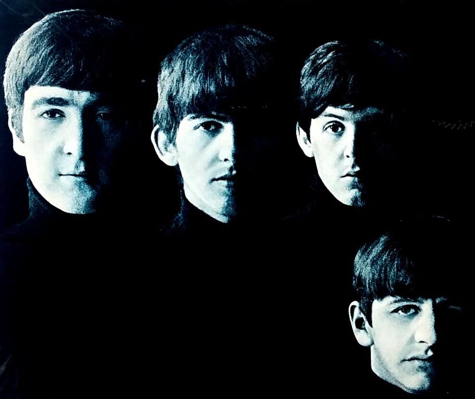
Robert Freeman took perhaps the most iconic photograph in music history when he snapped a picture of the Beatles in a hotel hallway in 1963. The half-shadowed faces on With the Beatles became the visual template for what a serious rock band should look like. Before Freeman, album covers were just headshots of people grinning like they were posing for yearbook photos. After Freeman, darkness and moodiness were aspirational. 📸
The Man Who Made Them Look Like Artists
Freeman’s run as the Beatles’ house photographer lasted from 1963 to 1966, during which he shot five consecutive album covers and established a visual language for the band that was as important as George Martin’s production. Then, just as suddenly as he’d arrived, he was gone. Replaced by an illustrator for Revolver, sidelined entirely for Sgt. Pepper, and never brought back into the fold even as the Beatles continued releasing albums through 1970. What happened? Short answer: the Beatles outgrew him. The longer answer is more interesting.
When Freeman first met the Beatles in August 1963, they were still wearing matching suits and had yet to crack America. He was a jazz photographer who’d worked with John Coltrane and understood how to make musicians look serious rather than approachable. The setup for With the Beatles was deceptively simple: four faces emerging from darkness, half-lit, wearing black turtlenecks, no smiles. It looked like album covers for French existentialist films, not pop music. 🖤
In a tribute he wrote when Freeman died in 2019, Paul McCartney recalled:
People often think that the cover shot for Meet The Beatles of our foreheads in half shadow was a carefully arranged studio shot. In fact, it was taken quite quickly by Robert in the corridor of a hotel we were staying in where natural light came from the windows at the end of the corridor.
The effect was transformative. Manager Brian Epstein had spent months trying to make the Beatles look clean-cut and non-threatening to parents. Freeman made them look like they didn’t care what your parents thought. The cover became so influential that every band for the next three years tried to replicate it—the Stones, the Kinks, the Who all attempted variations on the moody-faces-emerging-from-darkness template. Freeman had accidentally invented the visual vocabulary of rock credibility.
For A Hard Day’s Night in 1964, Freeman gave them the grid of faces—five images each, twenty portraits total, showing different expressions. It was playful without being childish, artistic without being pretentious. The album was the soundtrack to their first film, and Freeman’s cover made it clear this wasn’t just a cash-grab movie tie-in. This was Art. 🎬
Then came Beatles for Sale in late 1964, and Freeman did something unexpected: he made them look sad. Shot in autumnal Hyde Park, the four Beatles stare at the camera with tired, slightly melancholic expressions. They’d spent 1964 being chased around the world by screaming fans, and Freeman captured what that exhaustion looked like. No other pop band at the time would have allowed a cover that suggested they were anything less than thrilled to be famous. The Beatles did, because Freeman made it look cool. 🍂
The Beginning of the End
Help! in 1965 should have been the warning sign. Freeman shot the cover—the four Beatles in ski clothes spelling out a message in semaphore flag positions. Except they’re not actually spelling “HELP.” Freeman arranged them for visual composition rather than accuracy, and the actual semaphore reads something like “NUJV.” When this was pointed out, everyone shrugged. It looked good, and that was what mattered. But the willingness to prioritize aesthetics over meaning was very Freeman, and increasingly not very Beatles. 🎿
By Rubber Soul in December 1965, the relationship was starting to show cracks. The famous stretched, distorted faces on the cover were actually an accident.
McCartney recalled:
His normal practice was to use a slide projector and project the photos he’d taken onto a piece of white cardboard which was exactly album sized, thus giving us an accurate idea of how the finished product would look. During his viewing session the card, which had been propped up on a small table, fell backwards, giving the photograph a ‘stretched’ look. Instead of simply putting the card upright again, we became excited at the idea of this new version of his photograph. … Because the album was titled Rubber Soul, we felt that the image fitted perfectly.
It became one of the most recognizable album covers of the sixties, but it also revealed something important: the Beatles were now making aesthetic decisions themselves rather than deferring to their photographer. Freeman was still technically in charge, but the band was increasingly directing the vision. 🎸
The cover also showed the absolute limit of what Freeman could do with photography. He could make them look moody, playful, tired, or distorted, but he couldn’t make them look psychedelic. He couldn’t make them look like the music was starting to sound.
Enter Klaus Voormann
For Revolver in August 1966, the Beatles hired Klaus Voormann, an old friend from Hamburg, to create a pen-and-ink illustration featuring collaged photographs and surreal line drawings. It was unlike any album cover that had come before, and it signaled a complete departure from Freeman’s stark realism. The Beatles were no longer interested in looking like sophisticated jazz musicians. They wanted to look like their minds were expanding. Freeman couldn’t deliver that with a camera. 🖊️
Freeman wasn’t fired, exactly. He wasn’t replaced with another photographer. He was replaced with a different medium entirely. The Beatles had moved past photography as the primary visual language for their work. By the time Sgt. Pepper rolled around in 1967, they needed pop art collage, not moody portraits. Peter Blake and Jann Haworth created the now-iconic cover, and Freeman was nowhere in the conversation. 🎭
Why They Never Came Back
Even when the Beatles could have used Freeman again, they didn’t. The White Album in 1968 had a completely blank white cover with just the embossed title—no photo needed. Abbey Road in 1969 was a simple photograph of them crossing the street, which Freeman could have easily shot. Let It Be in 1970 used individual portrait photos that any competent photographer could have handled. But they never called Freeman back. 🚶
Part of this was practical: by 1968, the Beatles had largely stopped working as a unified group. They recorded separately, socialized separately, and certainly didn’t coordinate on album cover shoots the way they had in 1963. The idea of gathering all four Beatles for a Freeman photo session was increasingly impossible.
But the deeper reason is that Freeman represented an era they’d left behind. His aesthetic was early-sixties sophistication—darkness, moodiness, European art film sensibility. By the late sixties, that looked dated. The Beatles were interested in Indian mysticism, avant-garde experimentation, and pastoral English countryside vibes. Freeman’s half-shadowed faces in black turtlenecks belonged to a different band entirely. ☮️
The Legacy
Freeman went on to photograph other bands and pursue other projects, but he never again captured anything as culturally significant as those five Beatles covers. How could he? Those images defined an entire era. The half-shadowed With the Beatles faces are so iconic that parody versions still circulate today. The stretched Rubber Soul faces became shorthand for sixties experimentalism. Freeman’s work didn’t just document the Beatles—it helped create the visual language of rock music as a serious art form. 📷
The irony is that Freeman’s aesthetic eventually came back into fashion. Modern indie bands still borrow his moody, high-contrast, black-and-white approach. Those With the Beatles faces look timeless in a way that the Sgt. Pepper collage, for all its brilliance, doesn’t quite manage. Freeman created something that lasted. He just didn’t get to stick around long enough to see the Beatles through to the end.
Five album covers in three years, and then he was gone—replaced by illustrators, pop artists, and eventually nobody at all. The Beatles didn’t need a house photographer anymore. They’d become the image themselves. 🎨