There are two sides of developments in fertility.
Today I’m going to focus on news about what is happening and why, and next time I’ll ask what we’ve learned since last check-in about we could perhaps do about it.
One could consider all this a supplement to my sequence on The Revolution of Rising Expectations, and The Revolution of Rising Requirements. That's the central dynamic.
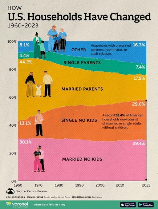
Household Composition
What is happening? A chart worth looking at every so often.
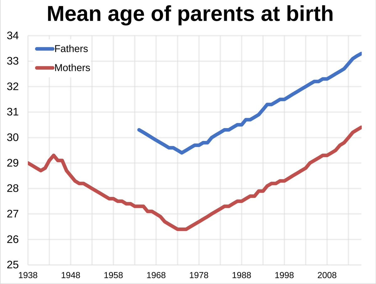
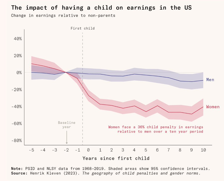
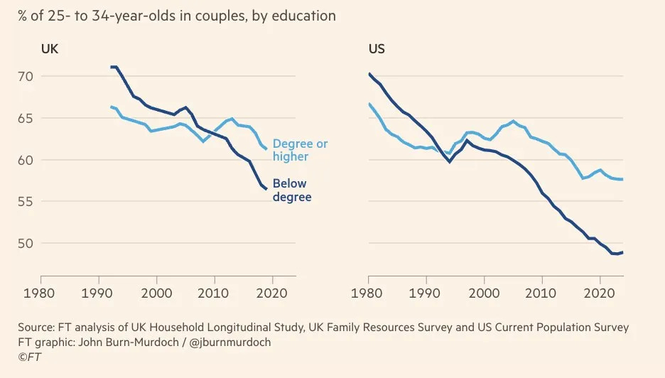
Timing
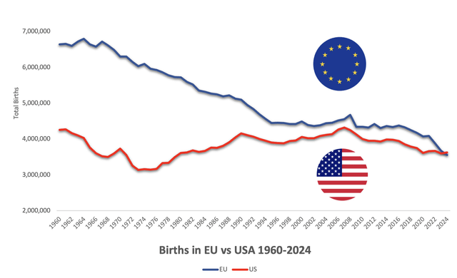
Michael Arouet: No way. WTF happened in 1971?
This is United States data:
The replies include a bunch of other graphs that also go in bad directions starting in 1971-73.
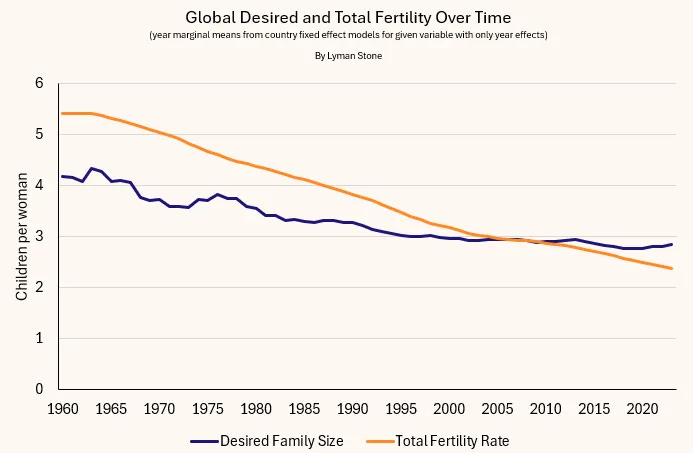
Developmental Idealism
Lyman Stone, in his first Substack post, lays the blame for fertility drops in non-Western countries primarily on drops in desire for children, via individuals choosing Developmental Idealism.
Lyman Stone: Five Basic Arguments for Understanding Fertility:
---
Outline:
(00:46) Household Composition
(01:06) Timing
(01:37) Developmental Idealism
(04:47) Pessimism
(05:51) Baby Boom
(06:53) Paperwork
(08:24) Car Seats As Contraception
(11:14) You Can't Afford It
(12:23) Yes The Problem Is Often Money
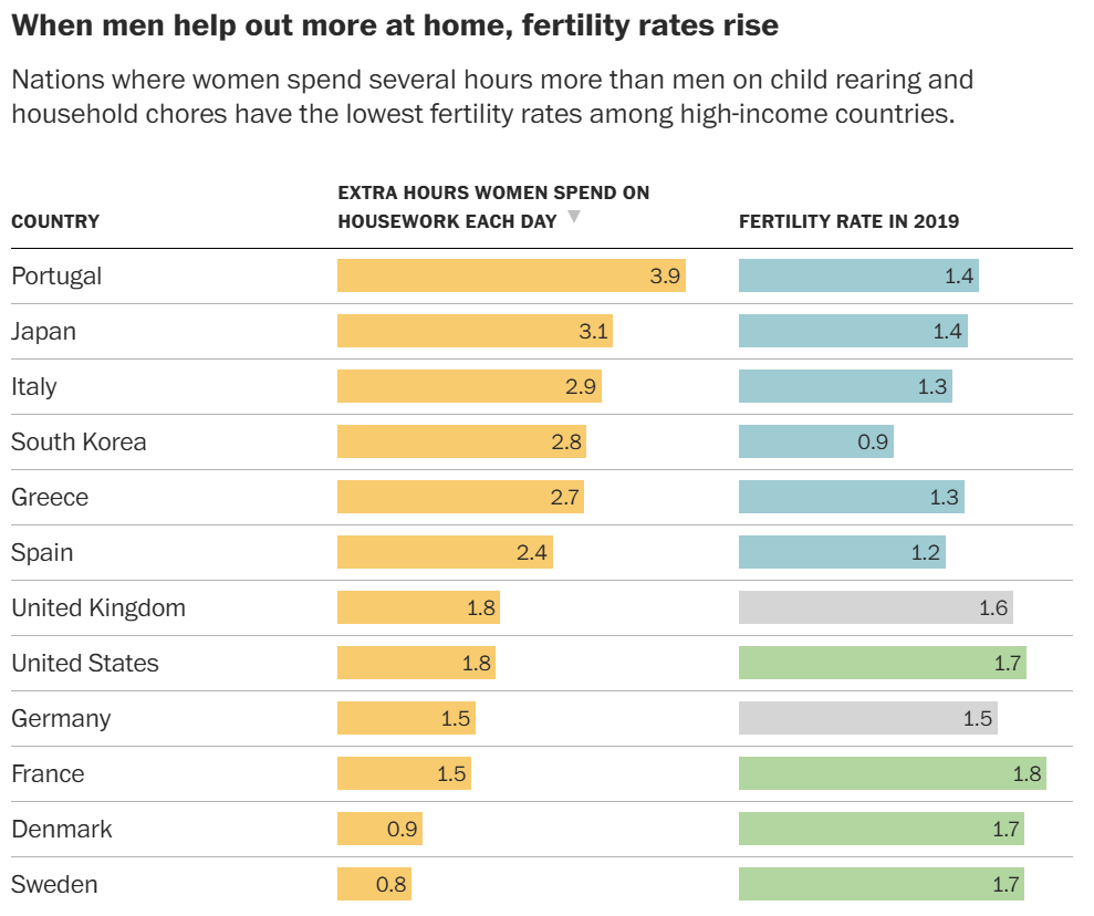
(12:57) Housework
(15:13) Greedy Careers
(18:24) The Appeal of Child-Free
(19:30) Motivation
(22:06) Grandparents
(25:26) Expectations of Impossibility
(28:04) Isolation
(30:00) Decoupling
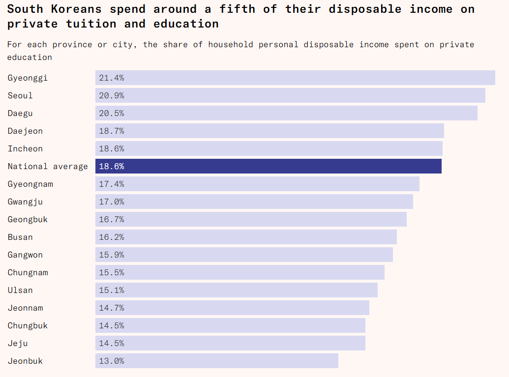
(31:45) South Korea
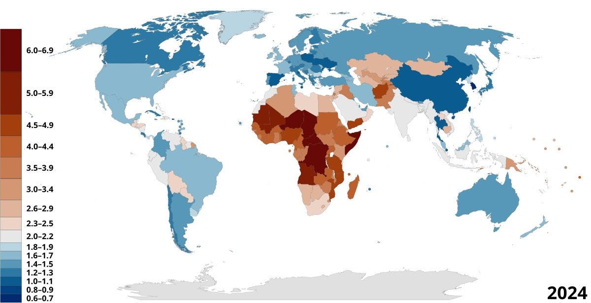
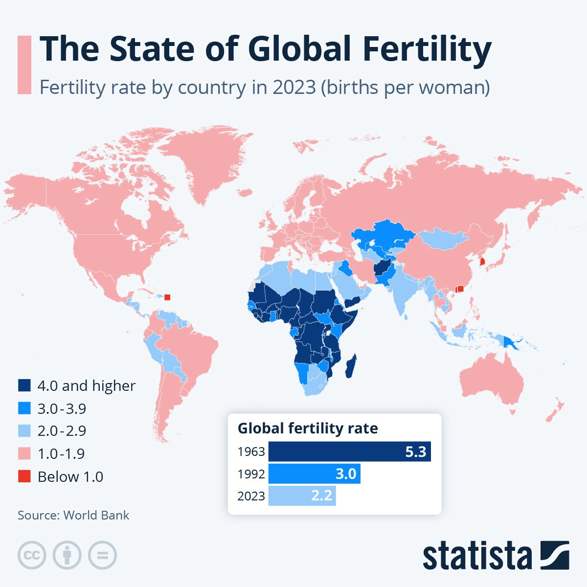
(39:20) World
(39:54) Various Places in Trouble
(40:51) China
(44:25) Russia
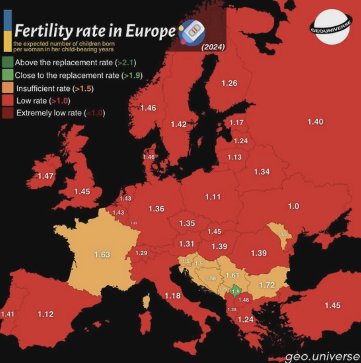
(44:39) Europe
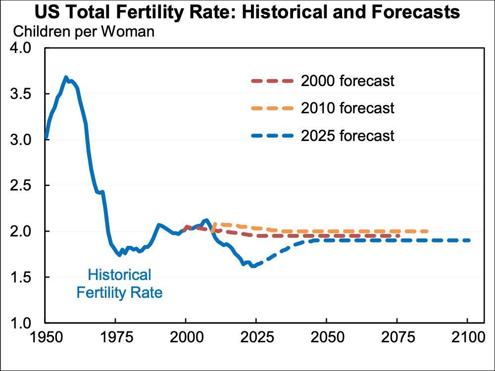
(45:34) America
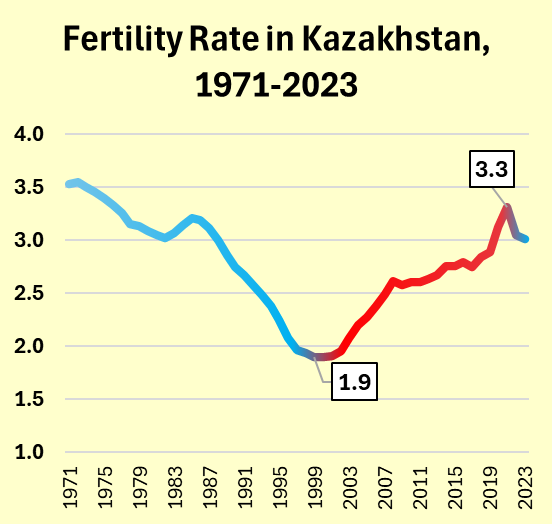
(46:43) Kazakhstan
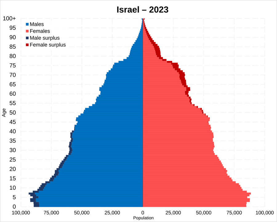
(47:10) Israel
(48:56) Consequences
(49:49) Unfounded Optimism
(50:56) History
(51:44) Implications
---
First published:
January 2nd, 2026
Source:
https://www.lesswrong.com/posts/SSQDuWDsbXH3kujPb/fertility-roundup-5-causation
---
Narrated by TYPE III AUDIO.
---
Images from the article:


Apple Podcasts and Spotify do not show images in the episode description. Try Pocket Casts, or another podcast app.
