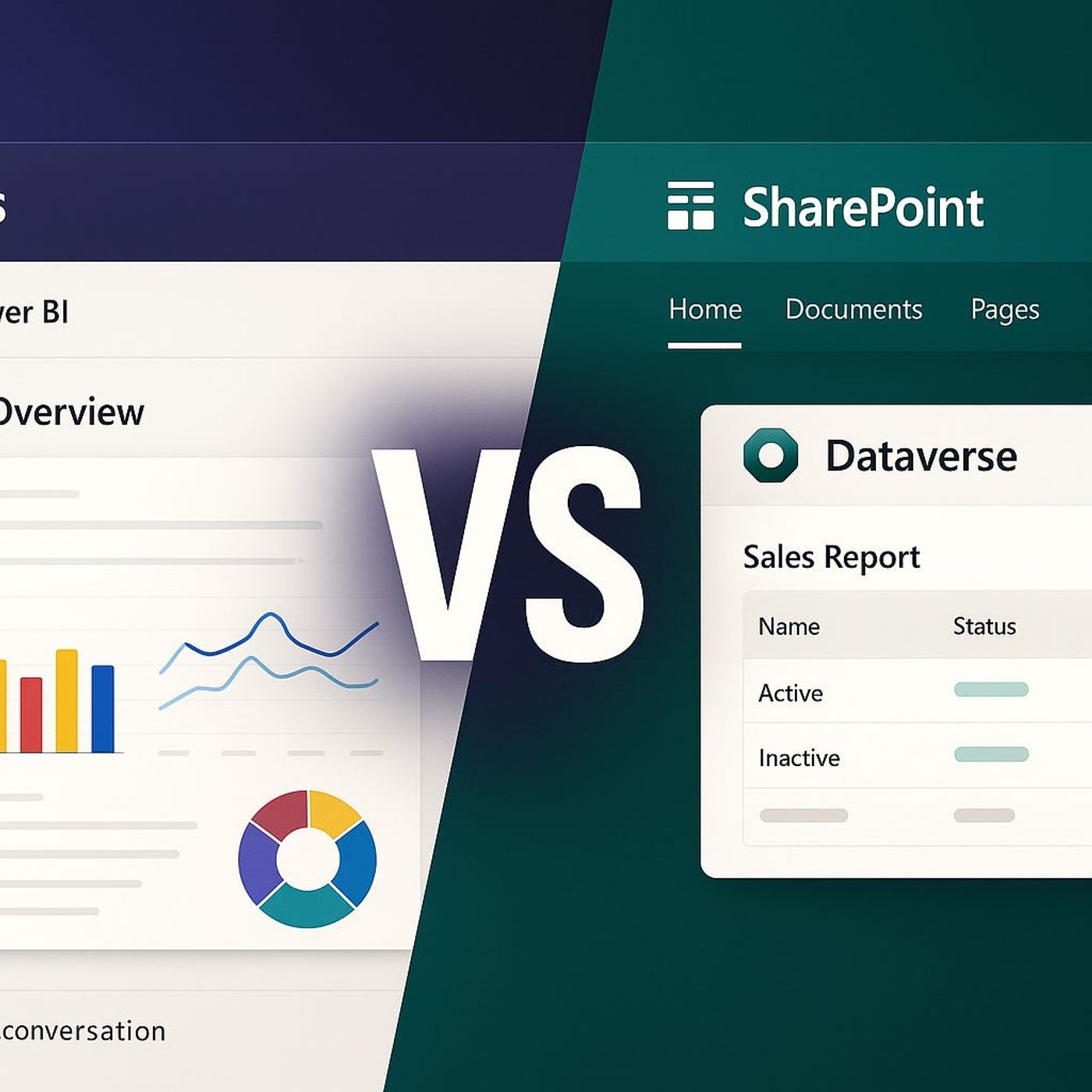
Ever wondered why your Dynamics 365 dashboards behave differently in Teams compared to SharePoint? If your field teams and execs keep asking for 'just one place' to see all the data, you're not alone. Today, we're putting Power BI, Dataverse, Teams, and SharePoint head-to-head. Which setup actually delivers the best experience, and which one quietly causes more headaches than it solves? Stay tuned—this comparison could save you hours on your next rollout.When 'Just Embed It' Fails: Why Teams and SharePoint Aren’t the SameIf you've ever tried to “just embed” a Dynamics 365 dashboard—slapping it into both Teams and SharePoint, expecting it to work everywhere—you already know it’s never that smooth. On the surface, it feels obvious: pick one spot, add your Power BI or Dataverse visuals, and call it a day. But it doesn’t take long to spot the cracks. Organizations crave a single source of truth, but the reality is that Teams and SharePoint treat your dashboards in their own unique ways. The platforms look similar on paper, but their rules are different enough to trip up even seasoned IT admins. One side leans hard into active team-based conversations, live chats, and mobile alerts. The other wants rich visuals, polished layouts for company portals, and something leadership can print and stick in a meeting folder.Picture what happens when you squish everyone’s needs into a single embedded dashboard. The field sales team fires up Teams on their phones during a customer visit. They’re expecting to see the latest numbers—the deals closed, the inventory changes from this morning, and that all-important quarterly performance. Instead, there’s a mismatch. Sometimes the data lags by a few hours. They wonder if something broke. Meanwhile, the executive group pulls up a glossy SharePoint page with up-to-date charts. Looks slick. But when someone wants to click into that sales region for more details, drill-down features don’t work—they’re stuck with static views.This isn’t just a technical footnote. Microsoft’s own documentation will trip you up if you gloss over the separation. In Teams, embedding a Power BI dashboard often means you get a focused set of features baked in. It feels streamlined, because Teams wants to keep you inside that chat-driven workflow—open a tab, see the data, get moving. On the other hand, SharePoint’s web parts promise deeper design options, but with those options come limits. Not every interactive feature makes the leap from Power BI to SharePoint, despite the shared Microsoft DNA. Try exporting that beautiful chart—sometimes you can, sometimes you can’t, depending on the integration method you picked.I’ve seen organizations bump into the same roadblock over and over. Take a mid-sized manufacturing company that wanted to unify numbers across their operations team and the leadership suite. They shoehorned one dashboard into both platforms and figured they were future-proofed. Instead, the support desk lit up with tickets. Sales staff complained about data delays in Teams. Managers grumbled about dashboards that looked fine in SharePoint but didn’t let them access the numbers that mattered most to their teams. Even the IT department got caught in the crossfire, fielding daily emails asking, “Why is my data missing here but not there?”If you follow the MVP conversations—the folks living and breathing Microsoft 365 every day—the split in philosophy comes up again and again. Teams is designed for collaboration. It wants to be a place where quick decisions and constant updates flow. SharePoint is engineered for publishing—more structured and designed, focused on long-term info sharing. That difference shapes everything about your dashboard. In Teams, it’s all about just-in-time updates, real-time context, and a workflow that fits into chats or mobile notifications. Drop that same dashboard into SharePoint and suddenly the need shifts to presentation, formal reporting, and a polished look for external reviews.Choosing where your dashboard lives isn’t a minor technical detail. It sets the tone—how your organization interacts with numbers, what kind of conversations take place, and whether users trust the information at all. The platform dictates not only how data appears, but also if end users trust its accuracy and usability. Users get savvy fast. If a field rep keeps seeing yesterday’s info or a CFO can’t get a proper export, it only takes a few incidents before trust breaks down and back-channel spreadsheets reappear.There’s a quiet but real risk here. When the dashboard doesn’t fit the workflow, people revert back to old habits. That under-the-radar Excel sheet makes a stealth comeback. Department heads start requesting manual reports again, just to double-check the “official” numbers. And, worst of all, you never hear about the trust issues until things are already off the rails. Microsoft’s official documentation points out plenty of gotchas: modern web parts in SharePoint may support Power BI embedding, but not always with the same real-time data or interactive filtering. Teams tabs can auto-refresh, but embedding anything complex or interactive sometimes breaks if licensing isn’t set up exactly right—or if a Teams update nudges permissions unexpectedly. The quirks stack up fast, and the support requests follow. So, you’re left with a decision that’s more strategic than technical. Are you optimizing for hands-on, live collaboration? Or for high-visibility publishing where form beats function? The answer shifts what success even looks like. If you want your dashboard rollout to stick, you’ll end up tweaking not just visuals, but the whole relationship between people, data, and the place they see it. And that alone answers why you can’t just copy and paste your dashboard everywhere and expect it to work.What it all boils down to is this—the place you embed your dashboard actively shapes the way your teams use, understand, and trust the numbers. If adoption falls apart, it’s rarely the dashboard itself to blame, but the disconnect between data, platform, and audience. And let’s be honest, nobody wants to be the one explaining why the numbers on Teams don’t match what’s on SharePoint.Data freshness often causes the loudest complaints—like when last week’s results suddenly appear in today’s dashboard—so let’s look at why real-time access isn’t as easy as clicking “refresh.”Live Data or Yesterday’s News? Data Freshness and Security in the Real WorldWe’ve all sat in meetings where someone asks, “Why is this number different from the last report?” It almost always comes down to one thing: data freshness. No matter how shiny your dashboard looks, if it’s not up to date, trust evaporates—especially for the field teams who depend on Teams during fast-moving situations. Their expectation is simple. They open Teams, click a tab, and want today’s information without lag or excuses. Executives in SharePoint care about accuracy too, but their stakes tend to be higher. A board decision based on old numbers can have much bigger consequences than a missed sales update. Yet, the irony is, both groups think they’re looking at the same “source of truth.” They aren’t.Let’s walk through a day in the life for teams that live and breathe these dashboards. Take a logistics crew running daily deliveries across multiple cities. The dashboard in Teams shows routes, drop-offs, and status. One driver pulls up their phone at 9 a.m., expecting a live update on urgent package reroutes from overnight. Instead, the numbers look wrong—yesterday’s stuck packages haven’t cleared, and today’s high-priority orders aren’t showing up at all. The supervisor checks the same dashboard, but on desktop, and sees a similar lag. Meanwhile, on SharePoint, leadership has a stylish board report. It auto-refreshes every night, so at 8 a.m., all the data is technically “fresh”—as of last midnight. If there’s a hiccup, or a fleet issue pops up after hours, it’s missing from the morning report. It’s easy for key patterns or urgent changes to slip through the cracks because the updates just aren’t fast enough for real-time action.It’s tempting to believe that embedding Power BI everywhere solves the problem. But the devil’s in the details—and in the licensing. Direct Power BI embeds in Teams can push near-instant updates, as long as Pro licenses are assigned and your dataset’s refresh schedule checks out. If the company starts running low on those licenses, or there’s a last-minute user swap, dashboards won’t update—they may not even display at all. It gets even trickier when you try to use Dataverse for Teams as a solution. Dataverse is great for providing a centralized place for Dynamics data inside Teams, but it’s tightly scoped. Not every table or real-time workflow shows up, and data refreshes happen on its own, sometimes unpredictable, schedule. SharePoint’s web parts? They rely on dataset refreshes set by admins—often just a nightly update because frequent refreshes require manual setup and more performance overhead.If you poke around on Microsoft’s documentation or community forums, you’ll spot a common pattern. Users sound off about dashboards that lag behind, or interactive features that suddenly freeze with no error message except “Data could not be loaded.” Complex Dynamics implementations, with multiple related tables, make things even slower. There’s a reason “refresh delay” is one of the most-searched complaints for both Power BI and SharePoint integrations. Any time you add new relationships, tie in custom Power Automate flows, or build DAX calculations that reference multiple sources, the risk of stale or blank data just increases. Community answers often amount to, “Check your refresh schedule, upgrade licensing, and hope it resolves.” That’s not exactly comfort for a field team looking for numbers on the fly.Organizations run into the same headaches, even when they invest in both platforms. Take the case of an energy company juggling d
Become a supporter of this podcast: https://www.spreaker.com/podcast/m365-fm-modern-work-security-and-productivity-with-microsoft-365--6704921/support.
If this clashes with how you’ve seen it play out, I’m always curious. I use LinkedIn for the back-and-forth.