Shows

The PolicyViz PodcastVisualizing the Future: Navigating the Shifts in Data Storytelling with Enrico BertiniYou know Enrico Bertini, right? Writer, teacher, co-host of the Data Stories podcast, Enrico does it all. Now at Northeastern University, I invited Enrico to the show to talk about his research, great Substack newsletter, and for views on the evolving landscape of data visualization on social media. In our discussion, Enrico emphasized the significance of interdisciplinary collaboration at Northeastern University. He has some concerns about the current state of visualization theory and tools and talks about his ideas around “critical data thinking” as a crucial way of thinking about data visualization, highlighting the challenges of data accuracy and inte...
2024-05-1436 min
Data StoriesFormalizing Design with Gabrielle Mérite and Alan WilsonData design systems and styleguides are currently a huge trend in the data design world. Moritz is joined by Gabrielle Mérite and Alan Wilson and together we exchange experiences in this emerging space, from designing dataviz components as part of Adobe Spectrum, the styleguide for Deloitte’s Insights Magazine or the WHO Data Design Language. Gabriele also wrote about adding touches of ethical guidance in guidelines in one of her recent newsletters. Enjoy!
Related episodes
Challenges of Being a Vis Professional in Industry with Elijah MeeksData Visualization at Capital One with Kim Rees and Steph Hay
2023-03-081h 03
Data StoriesCatching up with Amanda Makulec
Hey all, we are back!
In this episode, we have Amanda Makulec to catch up on what happened during this whole period of time.
Amanda is a public health and data visualization expert and she is the Executive Director of the Data Visualization Society.
In the episode, we talk about the Data Visualization Society, the new Information is Beautiful Awards (now organized by the DVS team), and how visualization has evolved lately.
Links
WHO Data Design Language
Climate & Conflict Analysis for German Foreign Office
Enrico’s FILWD Newsletter
ht...
2022-09-0959 min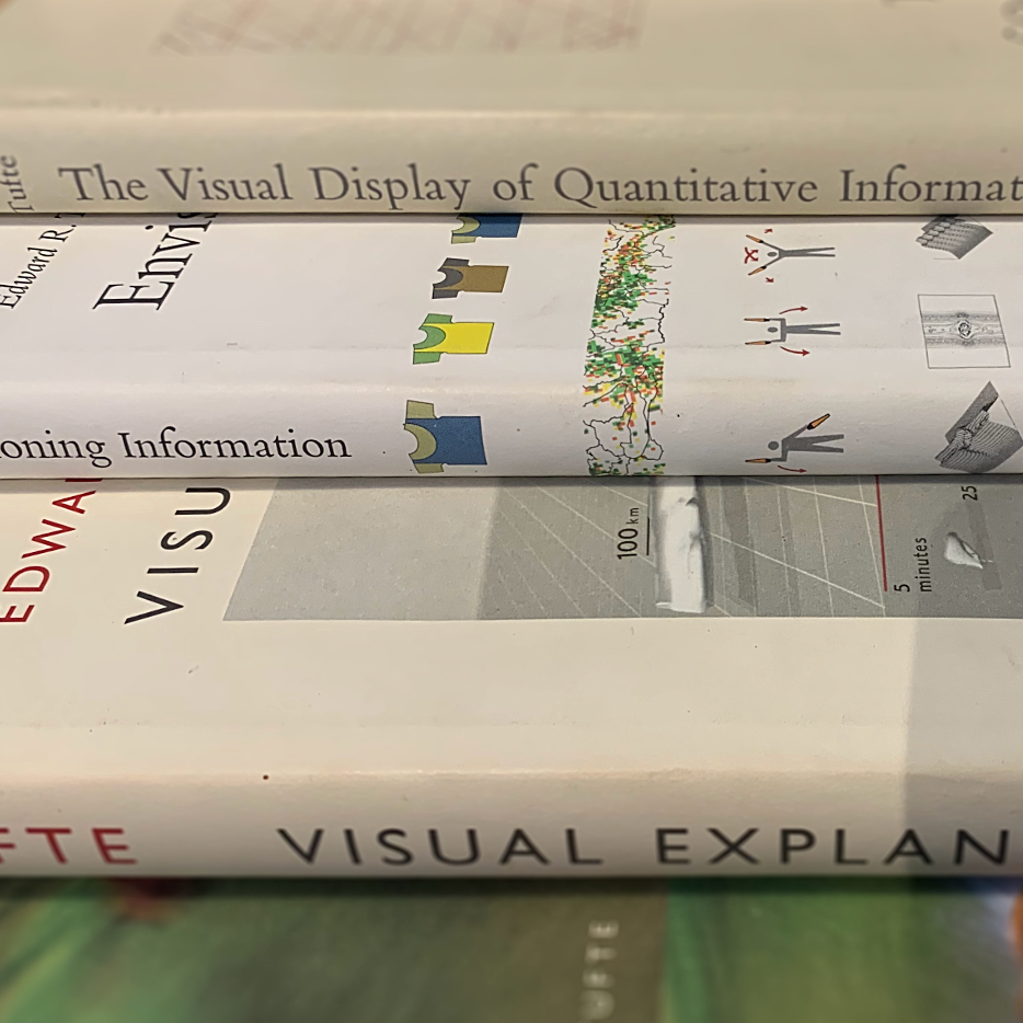
Data StoriesEdward Tufte's complete work with Sandra Rendgen
We have our friend Sandra Rendgen on the show to talk about the work of Edward Tufte. Tufte does not need any introductions of course. We discuss his early works and efforts, all the books he published, his contribution and legacy and the influence he had on our work.
Enjoy the show!
Remember: our podcast is listener-supported, please consider making a donation! Using Patreon or Paypal. Thanks
Links
Impfdashboard
Enrico’s ML vis work: Slice Lens
Observable notebooks for teaching
Our guest: Sandra Rendgen
First book “The Visual Display of Quant...
2021-03-091h 06
Data StoriesPeople of the Pandemic with Shirley Wu
We have renowned data visualizer Shirley Wu with us again (we had her before in episode 98) to talk about a new project she and her team developed to help people reason about the covid19 pandemic at a local community level. The team developed a simulation game that shows you what happens when you make certain sets of decisions over time that may affect the spread of the virus. You can play with others and your goal is to cooperate.
Needless to say the tool uses some really interesting visualizations also but this is not the main point. It’s...
2020-06-0339 min
Data StoriesVisualizing COVID-19 with Carl BergstromPhoto Credit: Kris Tsujikawa
We hope everyone is doing well! We finally decided to record an episode on visualization and covid19. It’s been a crazy several weeks and one of the most interesting developments has been to see how prominent visualization has been in the constant flux of information. Who expected visualization to be so relevant, uh?!
And when we talk about data and pandemics we could not find a better person than Carl Bergstrom, Professor of Biology at University of Washington, with a background in epidemiology but also an expert in scientific practices and communication....
2020-05-2052 min
Data StoriesViz Agencies: Dataveyes and Accurat
This is our second episode of our mini-series on data visualization agencies. For this episode we have Caroline Goulard from Dataveyes and Gabriele Rossi from Accurat. With them we talk about their quintessential projects, how to balance experimental with regular customers’ projects, and how the data visualization field changed over the years.
[Our podcast is fully listener-supported. That’s why you don’t have to listen to ads! Please consider becoming a supporter on Patreon or sending us a one-time donation through Paypal. And thank you!]
Enjoy the s...
2020-04-1655 min
Data StoriesViz Agencies: CLEVER°FRANKE and Interactive Things
This is the first episode of a mini-series of Data Visualization agencies. After so many years producing this podcast we realized we never really focused on agencies and we decided it’s time to rectify! Agencies have slowly become one of the most relevant realities of the data visualization ecosystem and business landscape. In this first episode, we have Thomas Clever to talk about Clever Franke and Benjamin Wiederkehr from Interactive Things. They have been around for more than 10 years and they have produced some really amazing work.
On t...
2020-04-0258 min
Data StoriesSpatial Thinking with Barbara Tversky
We have Barbara Tversky with us to talk about “spatial cognition”; the way humans perceive space and how space perception is related to the many ways we think. Barbara is a renowned cognitive scientist and a Professor of Psychology and Education at Columbia University. She has an extensive literature on spatial cognition and specific research on how people perceive and use diagrams, maps and other visual representations.
On the show we talk about her new book called “Mind in Motions” in which Barbara describes her research and the many fascinating ways space and motion play a pivota...
2020-03-1957 min
Data StoriesVisualizing Fairness in Machine Learning with Yongsu Ahn and Alex Cabrera
In this episode we have PhD students Yongsu Ahn and Alex Cabrera to talk about two separate data visualization systems they developed to help people analyze machine learning models in terms of potential biases they may have. The systems are called FairSight and FairVis and have slightly different goals. FairSight focuses on models that generate rankings (e.g., in school admissions) and FairVis more on comparison of fairness metrics. With them we explore the world of “machine bias” trying to understand what it is and how visualization can play a role in its detection and mitigation.
[Ou...
2020-03-0543 min
Data StoriesFlourish with Duncan Clark
Duncan is the CEO of Flourish, a popular data visualization tool to help people create storytelling visualizations from data. Duncan founded Flourish together with Robin Houston in 2016 and since then they made a lot of progress and acquired a large user base. It’s always great to hear about successful data visualization companies!
On the show Duncan describes what Flourish is, how it works and how it differs from other data visualization tools. We also talk about the unique playback option Flourish has and the “talkies” feature, which introduces audio and sound elements to add to a v...
2020-02-1341 min
Data StoriesVisualizing Global Warming with IPCC with Angela Morelli and Tom Gabriel Johansen
We have Angela Morelli and Tom Gabriel Johansen to talk about their effort in developing infographics for several reports of the Intergovernmental Panel on Climate Change (IPCC). Creating such reports entails a very complex and orchestrated process that needs to end with a total consensus of all the participating countries. In the show Angela and Tom tell the story of what it takes to generate such reports and handle the complex process of co-designing such important report with a large group of scientists. Angela and Tom also provide a set of lessons learned visualization designers can use.
2020-01-3053 min
Data StoriesData Art and Visual Programming with Marcin Ignac from Variable
We have Marcin Ignac from Variable to talk about Data Art. Marcin and his studio have a very nice mix of data visualization and generative design projects creating stunning visuals for brands such as Nike and IBM.
On the show we talk about the scope and unique features of data art, the process the studio follows, the specific set of tools Marcin developed for visual programming and tips to get started with this kind of projects. See the long list of pointers in the links below!
[Our podcast is fully listener-supported. That’s wh...
2020-01-1546 min
Data StoriesYear in Review 2019
Hi everyone! We are once again at the end of a whole year. After having “end of the year episodes” with other podcasters, going around the world, and chatting with Andy and Robert, we decided to try something different this time: we asked a group of data visualization professionals to send us an audio snippet summarizing what happened in specific areas of the field over the last year. The result is a great multifaceted collage of stories and personalities. See below who we have interviewed and what they talked about.
Happy New Year! Thanks so much...
2019-12-191h 49
Data StoriesFuture Data Interfaces with David Sheldon-Hicks
In this episode we talk about “future interfaces” with David Sheldon-Hicks: interfaces that are developed in futuristic movies. David is the founder and creative director of Territory Studio. They are the people behind the screen design of a lot of iconic movies such as The Martian, Blade Runner and Ex Machina.
On the show, we talk about what it takes to develop this kind of interfaces and how they interact with film directors. We also talk about interaction paradigms and classic movies from the past. David also provides a few tips on how to get star...
2019-12-0444 min
Data StoriesHighlights from IEEE VIS'19 with Tamara Munzner and Robert Kosara
We have Tamara Munzner from the University of British Columbia, Vancouver, and Robert Kosara from Tableau Research on the show to go through some of our personal highlights from the IEEE Visualization Conference 2019. We talk about some of the co-located events, some of the technical papers and major trends observed this year. Make sure to take a look at the links below, there is a lot of material! And especially the videos. There are quite a few that have been posted online this year.
Enjoy the show!
[Our podcast is fully listener-supported. That’s w...
2019-11-201h 02
Data Storiesxkcd or the art of data storytelling with web cartoons
[Our podcast is fully listener-supported. That’s why you don’t have to listen to ads! Please consider becoming a supporter on Patreon or sending us a one-time donation through Paypal. And thank you!]
This episode is a dream come true – we have long wanted to invite Randall Munroe to the show. Randall is the mastermind behind the xkcd webcomics which have zillions of fans around the globe. In his stick figure cartoons and hilarious mini-stories, he comments on complicated scientific issues.
Over the years, Randall has also created a number of data-heavy visualiza...
2019-11-0549 min
Data StoriesCognitive Science for Data Visualization with Lace Padilla
[Our podcast is fully listener-supported. That’s why you don’t have to listen to ads! Please consider becoming a supporter on Patreon or sending us a one-time donation through Paypal. And thank you!]
In this episode we have Lace Padilla on the show to talk about how cognitive science can help create better visualizations. Lace is a newly appointed Assistant Professor at Cognitive UC Merced, where she directs the SPACE Lab.
Lace’s expertise is cognitive science, and she has published numerous papers that look at data visualization under the lens of a cogniti...
2019-10-2346 min
Data StoriesIconic Climate Visuals with Ed Hawkins
[Our podcast is fully listener-supported. That’s why you don’t have to listen to ads! Please consider becoming a supporter on Patreon or sending us a one-time donation through Paypal. And thank you!]
We have climate scientist Ed Hawkins on the show to talk about climate visualization. Ed is the person behind the famous spiral and stripe visualizations (see the images below). On the show we talk about how he created these visualizations and what was the impetus behind them. We also talk about breaking data visualization “rules”; climate visualization work from the visualization community...
2019-10-0939 min
Data StoriesSweating the details with Nicholas Rougeux
[Our podcast is fully listener-supported. That’s why you don’t have to listen to ads! Please consider becoming a supporter on Patreon or sending us a one-time donation through Paypal. And thank you!]
We have digital artist Nicholas Rougeux on the show to talk about his beautiful data art projects and the processes he follows. Nicholas created numerous iconic pieces with an extraordinary attention to details, such as “Seeing Music”, where he visualizes musical scores from famous composers, “Byrne’s Euclid”, a reproduction of Oliver Byrne’s geometric illustrations of Euclid’s theorem, and “Illustrations of the Natural Orders of P...
2019-09-2539 min
Data StoriesFT Data Crunch with Federica Cocco and John Burn-Murdoch
[Our podcast is fully listener-supported. That’s why you don’t have to listen to ads! Please consider becoming a supporter on Patreon or sending us a one-time donation through Paypal. And thank you!]
We have Federica Cocco and John Burn-Murdoch on the show to talk about their new Financial Times visualization series called Data Crunch. The series features Federica and John having a data-driven conversation about some social or economic trend while aided by graphs and charts. It’s a new way of doing data visualization. It’s casual but not trivial. Also, Federica and John draw by han...
2019-09-1140 min
Data StoriesHistory of Information Graphics with Sandra Rendgen
We have art historian Sandra Rendgen on the show to talk about where data visualization comes from. Sandra published two great books on the topic, one called “The Minard System”, on the great Minard and the “History of Information Graphics” with contributions from multiple authors.
On the show we talk about graphical systems in the middle ages, the great efforts in scientific cartography in the age of discovery and the innovation spurred by statistic al thinking and associated graphical formats.
As a final note: Sandra is also now our new producer! We are very happ...
2019-08-2147 min
Data StoriesThe Pudding with Matt Daniels
Matt Daniels from The Pudding
[Our podcast is fully listener-supported. That’s why you don’t have to listen to ads! Please consider becoming a supporter on Patreon or sending us a one-time donation through Paypal. And thank you!]
We have Matt Daniels on the show again (after more than 3 years!). Matt is the CEO of The Pudding, a collective of journalist-engineers that create visual essays that explain ideas debated in culture. Their pieces are incredibly engaging, somewhat witty and always stunning from the visual point of view.
Since our first interview with Matt, The Pudding...
2019-07-3152 min
Data StoriesData Is Personal with Evan Peck
[Our podcast is fully listener-supported. That’s why you don’t have to listen to ads! Please consider becoming a supporter on Patreon or sending us a one-time donation through Paypal. And thank you!]
We have Evan Peck on the show to talk about the research he and his students recently published on “Data Is Personal”. The study consists of 42 interviews made in rural Pennsylvania to see how people from different educational backgrounds ranked a set of various data visualizations.
The study raises a lot of questions about how people perceive data visualization, our assumptions about who o...
2019-07-1042 min
Data StoriesSketching and Visual Thinking with Eva-Lotta Lamm
[Our podcast is fully listener-supported. That’s why you don’t have to listen to ads! Please consider becoming a supporter on Patreon or sending us a one-time donation through Paypal. And thank you!]
We have Eva-Lotta Lamm joining us to talk about the value of sketching and how it relates to data visualization. Eva-Lotta is a UX designer turned expert on sketching and sketchnoting: the art of summarizing talks through sketches. In the show we talk about visual thinking, sketchnoting and parallels with data visualization.
Links
Sketchnotes from Moritz’s talk at FH PotsdamSo...
2019-06-1940 min
Data StoriesData Visualization Society
[Our podcast is fully listener-supported. That’s why you don’t have to listen to ads! Please consider becoming a supporter on Patreon or sending us a one-time donation through Paypal. And thank you!]
Have you heard of the “Data Visualization Society”? This is a new initiative started by visualization designers Amy Cesal, Mollie Pettit and Elijah Meeks. The DVS started with a simple form and a Slack channel and experienced in a few days a massive level of interest (more than 3000 people signed-up in a matter of days). On the show we talk with the founders to know m...
2019-05-2946 min
Data StoriesImmersive Analytics with Tim Dwyer
[Our podcast is fully listener-supported. That’s why you don’t have to listen to ads! Please consider becoming a supporter on Patreon or sending us a one-time donation through Paypal. And thank you!]
We have Tim Dwyer on the show to talk about Immersive Analytics, the use of virtual reality and other immersive technology to analyze and present data visually. Tim is a Professor of Data Visualisation and Immersive Analytics at Monash University in Melbourne and his research focuses on the human and technological aspect of immersive analytics. On the show we talk about what immersive analy...
2019-05-0850 min
Data StoriesTurning Data into Sound with Hannah Davis
[Our podcast is fully listener-supported. That’s why you don’t have to listen to ads! Please consider becoming a supporter on Patreon or sending us a one-time donation through Paypal. And thank you!]
How do you represent data with sound instead of graphical properties? Is it even possible?
It turns out that it’s not only possible, but there is an entire field — called sonification — that is dedicated to representing data with sound.
In this episode we are joined by Hannah Davis, a data visualization and sonification expert, to talk about how sonificatio...
2019-04-1850 min
Data StoriesVisualizing Earth with Cameron Beccario
[There are no ads on Data Stories because we’re listener-supported; please consider contributing to the show! Oh…and now Data Stories is on Instagram!]
Today we are joined by Cameron Beccario who created the immensely impressive Earth visualization — a beautiful, geeky, mesmerizing look at the small blue marble we call home. On the show Cameron tells us all about the story behind the project, its evolution, and its reception — plus, at the end, we have a bonus chat about the state of data visualization in Japan.
Enjoy the show!
Links
http://earth.nu...
2019-03-2836 min
Data StoriesSimulated Dendrochronology of U.S. Immigration with Pedro Cruz and John Wihbey
[There are no ads on Data Stories because we’re listener-supported; please consider contributing to the show! Oh…and now Data Stories is on Instagram!]
2019-03-0739 min
Data StoriesThe "Dashboard Conspiracy" with Lyn Bartram and Alper Sarikaya
[Our podcast is fully supported by our listeners. Please consider becoming a supporter on Patreon or sending us a one-time donation through Paypal. And thanks!]
Oh dashboards… dashboards… what are they? For some, they are just ugly examples of bad visualization design (speed dials anyone?). For others, they are a first citizen of the data visualization world that deserve to be learned, studied, and understood.
To dig into this debate, we have Lyn Bartram of Simon Fraser University and Alper Sarikaya of Microsoft Power BI on the show to talk about an exciting research...
2019-02-1245 min
Data StoriesVisualizing Uncertainty with Jessica Hullman and Matthew Kay[Our podcast is fully supported by our listeners. Please consider becoming a supporter on Patreon or sending us a one-time donation through Paypal. Thanks!]
What is uncertainty? Why is it important to take it into account when designing data visualizations? And how do you actually do so? We explore these and other questions with Jessica Hullman of Northwestern University and Matthew Kay of the University of Michigan. Jessica and Matt have written many publications on the topic that help orient us to the intricate world of uncertainty, probabilities, and their relevance to data visualization.
We hope...
2019-01-1955 min
Data StoriesYear Review 2018[Thinking of gift-giving this holiday season? Consider a gift to Data Stories! You can join our growing community of Patreons or make a one-time donation to us on Paypal.]
Here we go! Another year has passed and lots has happened in the data visualization world. This time we decided to scramble things up again with a new annual review format: five podcasters (including ourselves!) reflecting back on year 2018. We’re lucky to be joined by Jon Schwabish from PolicyViz, Alli Torban from DataViz Today, and Cole Nussbaumer Knaflic from Storytelling with Data.
This was a long...
2018-12-191h 40
Data StoriesA New Generation of DataViz Tools[Thinking of gift-giving this holiday season? Consider a gift to Data Stories! You can join our growing community of Patreons or make a one-time donation to us on Paypal.]
We have data visualization freelancer and old friend-of-the-podcast Andy Kirk with us to talk about a new generation of data viz tools. You may not have noticed yet, but there are a quite a few nice new tools in development — and they all seem to have one thing in common: granting more artistic freedom to users while requiring less programming.
On the show we start by talk...
2018-12-0646 min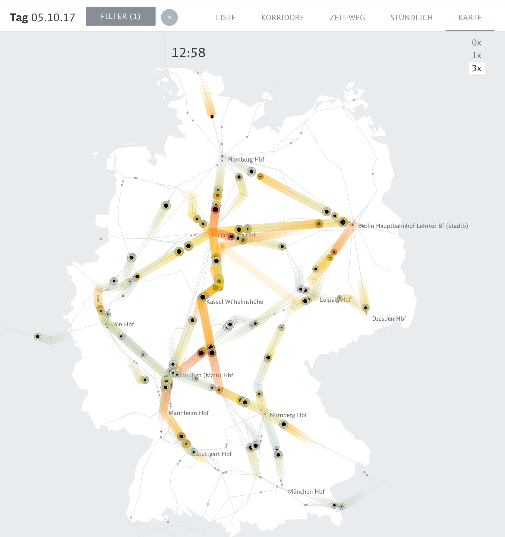
Data StoriesPeak Spotting[Thinking of gift-giving this holiday season? Consider a gift to Data Stories! You can join our growing community of Patreons or make a one-time donation to us on Paypal.]
“Would you define this as a dashboard?” The question provoked quite a reaction!
In this episode, we talk about Peak Spotting, a new data visualization tool designed to help capacity managers at the German railway Deutsche Bahn handle passenger loads within the train system.
We recorded the episode live in Berlin, all together in the same room, with Moritz, the creative lead of the project...
2018-11-2140 min
Data StoriesHighlights from IEEE VIS 2018[If you benefit from Data Stories, consider becoming a supporter on Patreon or making a one-time donation to us on Paypal. We fully depend on listener support to keep the show running!]
It was a great week in Berlin! Info+ and IEEE VIS took place at the same time and both Enrico and Moritz were there to document the conferences. We also organized a super fun Data Stories listeners meetup — more on that to come!
This week, our friends Jessica Hullman and Robert Kosara join Enrico to comment on their greatest highlights from IEEE VIS....
2018-11-0838 min
Data StoriesViews of the World with Robert Simmon
[Our podcast is fully listener-supported, which means that it’s actually your podcast! Please consider making a contribution on Patreon or sending us a one-time donation through Paypal. Help us to stay ad-free!]
This week we have Robert Simmon on the show to discuss satellite imagery. Robert is a data visualization engineer at Planet Labs, where he creates visualizations of the earth from satellite sensor data. Previously a Data Visualizer and Designer at NASA, Robert is also known as “Mr. Blue Marble” for the image of Earth he created, which Apple later adopted as their default...
2018-10-2552 min
Data StoriesVisual Perception and Visualization with Steve Haroz[Please remember that Data Stories is fully listener-supported! Please consider contributing to the show on Patreon or sending us a one-time donation through Paypal. Every dollar is appreciated!]
We have Steve Haroz on the show to talk about visual perception in visualization. Steve is a research scientist at Saclay, France near Paris (AVIZ) where he studies how “the brain perceives and understands visually displayed information like charts and graphs.”
Steve is also a very active figure on Twitter, where he is frequently asked to comment on visual perception problems in visualization.
On the show, w...
2018-10-0944 min
Data StoriesStorytelling with Data with Cole Nussbaumer Knaflic
[If you enjoy listening to our show, please consider supporting us on Patreon or sending us a one-time donation through Paypal. Data Stories runs thanks to your financial support!]
We have Cole Nussbaumer Knaflic on the show to talk about her work in visual storytelling. Cole is an educator, blogger, freelancer and author of Storytelling with Data, a successful data visualization book about effectively presenting data through visualization.
We talk about how Cole got her start in visualization through her former job at Google, how she created her business, the story behind her boo...
2018-09-2635 min
Data StoriesFlowingData with Nathan Yau[If you enjoy listening to our show, please consider supporting us on Patreon or sending us a one-time donation through Paypal. Data Stories runs thanks to your financial support!]
We have Nathan Yau with us on the show to talk about his mythical FlowingData blog. Nathan was one of the first people to write a blog about data and visualization, and he is one of the very few who continues to blog virtually every day after more than ten years.
If you want to know what has happened lately in visualization, you can’t go wrong...
2018-09-1237 min
Data StoriesResearching the Boundaries of InfoVis with Sheelagh Carpendale[If you like what we do, please consider supporting us on Patreon or sending us a one-time donation through Paypal. Data Stories runs thanks to your financial support. Thx!]
Sheelagh Carpendale is Professor in the Department of Computer Science at the University of Calgary, where she leads the Innovations in Visualization (InnoVis) research group. Sheelagh is one of the most prominent figures in visualization research and, this week, she joins us to discuss the research taking place in her lab, as well as her innovative ideas about all sorts of information visualization. Sheelagh is renowned for...
2018-08-0835 min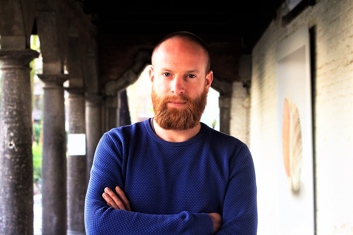
Data StoriesXenographics with Maarten Lambrechts[If you like what we do, please consider supporting us on Patreon or sending us a one-time donation through Paypal. Data Stories runs thanks to your financial support!]
Most often in data visualization we depend on traditional charts, but occasionally we stumble onto something new, maybe even something weird: something that is interesting and beautiful. How many charts of this type exist? And do they have anything in common?
In this episode we have Maarten Lambrechts on the show to talk about his Xenographics project: a growing collection of “unusual charts and maps.”
We talk...
2018-07-1838 min
Data StoriesTouch Graphics with Steve Landau[If you like what we do, please consider supporting us on Patreon or sending us a one-time donation through Paypal. Data Stories runs thanks to your financial support!]
As creators of data visualization, it is important for us to remember that many of our platforms are not accessible to people who are blind or visually impaired. What can we do to help non-sighted people access the wealth of information that we convey visually?
To discuss this topic we have on the show Steve Landau, the founder of Touch Graphics, a company that develops products that “rely...
2018-07-0335 min
Data StoriesVisualizing Climate Change Scenarios with Boris Müller
Data Stories runs thanks to the help of our listeners. Please consider supporting us on Patreon or sending us a one-time donation through Paypal. And thanks so much for your support!
This week, we have Prof. Boris Müller from FH Potsdam on the show! Moritz and Boris discuss the SENSES research project, which visualizes climate change scenarios. They also talk generally about design and science collaboration.
In other news, if you work in science and would like to improve your data visualization skills, make sure to check out the Graphic Hunters summer school...
2018-06-2033 min
Data StoriesDeclarative Visualization with Vega-Lite and Altair with Dominik Moritz, Jacob Vanderplas, Kanit “Ham” Wongsuphasawat
[Data Stories runs thanks to the help of our listeners. Please consider supporting us on Patreon or sending us a one-time donation through Paypal. And thanks so much for your support!]
We have Dominik Moritz, Jacob Vanderplas, and Kanit “Ham” Wongsuphasawat on the show to talk about Vega-Lite and Altair. Dominik and Ham are PhD students at the Interactive Data Lab at the University of Washington with Jeff Heer, and Jacob is the director of Open Software at the University of Washington’s eScience Institute and the main person behind the development of Altair, the porting o...
2018-06-0635 min
Data StoriesData Science and Visualization with David Robinson[Data Stories runs thanks to the help of our listeners. Please consider supporting us on Patreon or sending us a one-time donation through Paypal. And thanks so much for your support!]
This week we have David Robinson on the show to talk about data science, in particular the role of data visualization in data science. David is Chief Scientist at Data Camp and author of multiple data science books and R packages. He also writes a great blog called “Variance Explained.”
On the show we talk about visualization as a data analysis tool, the problem of val...
2018-05-2338 min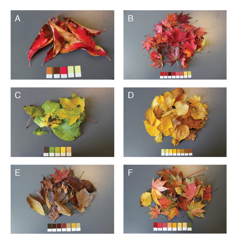
Data StoriesColor with Karen Schloss[This podcast is fully supported by our listeners. If you enjoy listening to Data Stories, consider supporting us on Patreon. And now we also accept one-time donations through Paypal: just use this link. Thanks so much for your support!]
In this episode we have Karen Schloss on the show to talk about color. Yes, color! Karen is Assistant Professor at the University of Wisconsin Madison where she conducts research on the effective uses of color in visualization and everyday tasks.
Karen walks us through the intricacies of color: explaining how it works and why it is...
2018-04-2754 min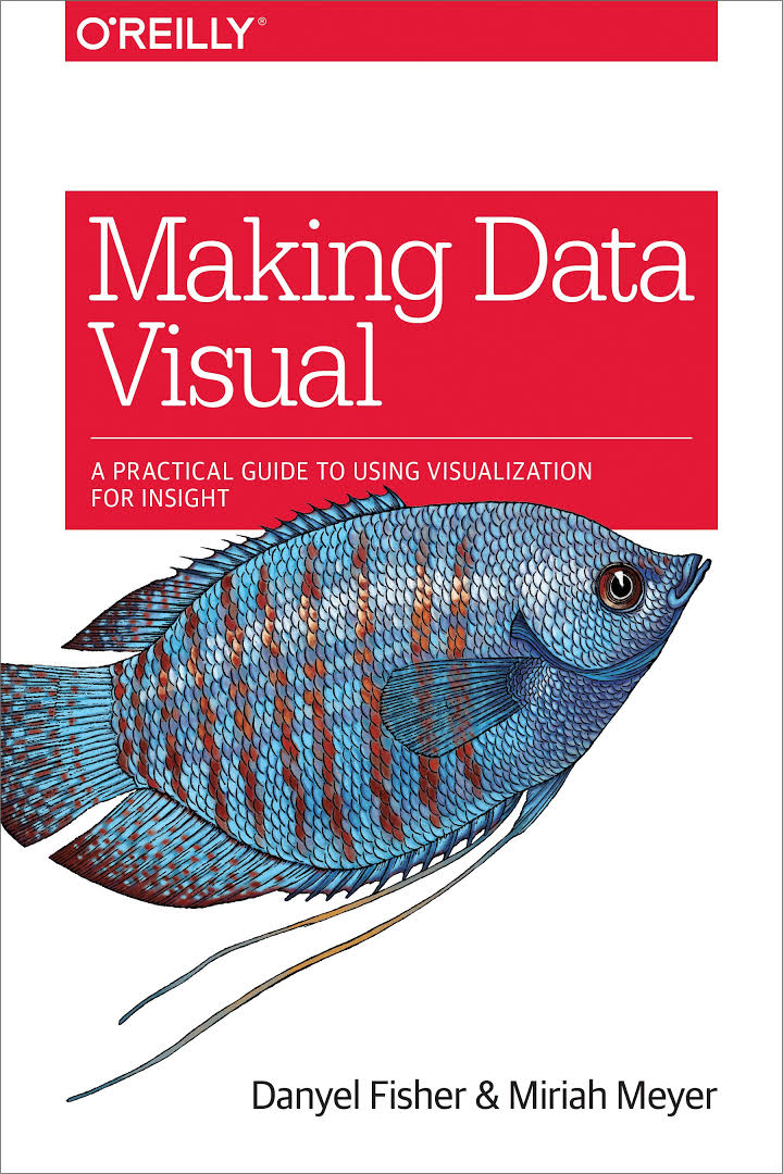
Data StoriesMaking Data Visual with Miriah Meyer and Danyel Fisher
[This podcast is fully supported by our listeners. If you enjoy listening to Data Stories, consider supporting us on Patreon. And now we also accept one-time donations through Paypal: just use this link. Thanks so much for your support!]
This week we have Miriah Meyer (University of Utah) and Danyel Fisher (Microsoft Research) on the show to talk about their new book Making Data Visual, which covers areas that other visualization books typically do not address: namely, how to go from formulating questions to building visualizations that solve actual problems that people have.
...
2018-04-1233 min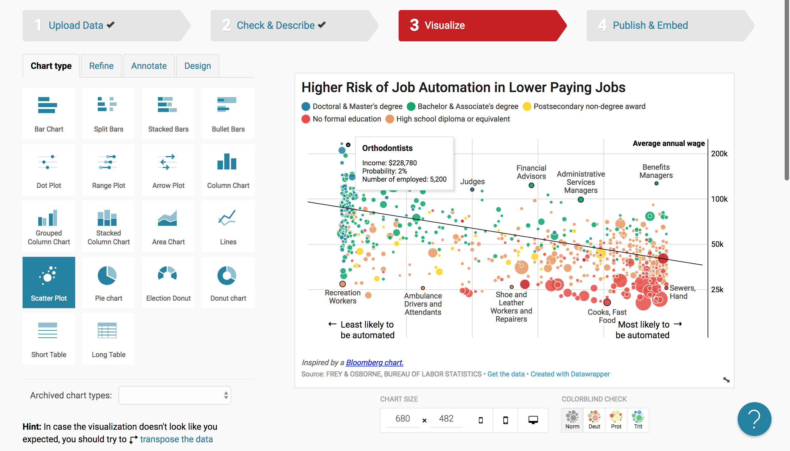
Data StoriesDatawrapper with Lisa C. Rost and Gregor Aisch
[This podcast is fully supported by our listeners. If you enjoy listening to Data Stories, consider supporting us on Patreon!]
We have Lisa C. Rost and Gregor Aisch on the show to talk about the exciting work they are doing at Datawrapper. Lisa and Gregor have recently joined the company in Berlin, coming from various experiences in data journalism in the US.
Lisa is known for her long, thoughtful and beautiful blog posts and visualization guides. Gregor is a former graphics editor at the New York Times and has also developed many useful vis...
2018-03-2142 min
Data StoriesCognitive Bias and Visualization with Evanthia Dimara
[This podcast is fully supported by our listeners. If you enjoy listening to Data Stories, consider supporting us on Patreon!]
We have Evanthia Dimara on the show to talk about cognitive bias and the role it plays in visualization. Evanthia has a PhD from INRIA and is now a postdoctoral researcher at the Institute for Intelligent Systems and Robotics (ISIR) in Paris. Her work focuses on data visualization and decision-making, and she specializes in understanding how bias affects our decisions when they are supported by visual representations.
On the show we talk about c...
2018-03-0642 min
Data StoriesHuman-Driven Machine Learning with Saleema Amershi
[This podcast is fully supported by our listeners. If you enjoy listening to Data Stories, consider supporting us on Patreon!]
How should we interact with machine learning? Is there a way to better understand what machine learning systems do and how? What role can visualization play in machine learning? These are some of the questions we discuss with Saleema Amershi on the podcast this week.
Saleema is a Researcher at Microsoft Research AI (MSR AI) where she works on technologies for helping people build and use machine learning systems.
On the sh...
2018-02-2038 min
Data StoriesMachine Learning for Artists with Gene Kogan
[This podcast is fully supported by our listeners. If you enjoy listening to Data Stories, consider supporting us on Patreon!]
If you haven’t heard talk about machine learning (ML) lately, you must be living under a rock! For our part, we have finally managed to record a whole episode on the use of ML for art and visualization. Artist and programmer Gene Kogan joins us on the show to talk about new developments in this space, as well as new challenges and opportunities. Gene has developed numero...
2018-01-3137 min
Data StoriesWhat Makes A Visualization Memorable? with Michelle BorkinIt’s a whole new year! Consider supporting Data Stories on Patreon!
Michelle Borkin is Assistant Professor at Northeastern University where she studies the use of visualization in science research, in particular how it impacts human perception and cognition. On the show we talk about how the data viz community can better support the work of scientists, her popular research on data visualization memorability and, of course, the infamous data viz dinosaur.
LINKS
Michelle Borkin
Michelle’s paper: “Evaluation of artery visualizations for heart disease diagnosis”
Michelle’s research on data visuali...
2018-01-1744 min
Data StoriesData Pottery with Alice Thudt
There are infinite ways to represent data. Here’s one of the more creative ones: Alice Thudt makes pottery — such as cups, plates, or teapots — that show data! Her project Life in Clay started off as a twist on a hobby, and has since become part of her PhD research on personal data visualization. In our conversation with Alice, we learn all about what it takes to put data on the table.
PS: At the end, you’ll also hear a quick update on the Information is Beautiful awards, where Alice scored an honorable mention! Congratulat...
2018-01-0331 min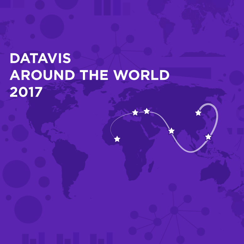
Data StoriesData Vis Around The World in 2017If you enjoy listening to Data Stories, consider becoming a supporter on Patreon. Thanks!
We are at the end of yet another full year, folks! And once again we have decided to go around the world to see what has happened in vis in a whole range of countries.
It’s been a long journey. This year we have, Spe Chen from Beijing, China; Pia Faustino from Manila, Philippines; Pinar Dag in Istanbul, Turkey; Justin Yarga from Ouagadougou, Burkina Faso; Harry Stevens in New Delhi, India; and Qristina Parjiani from Tbilisi, Georgia.
Let us know how...
2017-12-221h 39
Data StoriesWhat's Going On In This Graph? with Michael Gonchar and Sharon Hessney
On the show this week we have Michael Gonchar of the New York Times Learning Network and Sharon Hessney of the American Statistical Association to talk about the New York Times’s project, “What’s Going On In This Graph?”
The project aims to improve students’ visual literacy by analyzing a specific chart and participating in online discussions. Each month the New York Times publishes a new chart and ask students to discuss it by answering a series of questions: What do you notice? What do you wonder? Are there items you notice that answer what you wonde...
2017-12-0634 min
Data StoriesFeminist Data Visualization with Catherine D’Ignazio[If you enjoy Data Stories, consider supporting us on Patreon. The show is now fully funded by our listeners!]
We have Catherine D’Ignazio on the show this week to talk about feminist data visualization. Catherine is Assistant Professor of Data Visualization and Civic Media at Emerson College, where she works across art, design, science and research.
On the show Catherine explains how feminist theory can be used as a lens to look at some interesting problems in visualization and data analysis in general. We also talk about the struggle between objectivity and relativism, methods to...
2017-11-2351 min
Data StoriesReview of IEEE VIS’17 with Jessica Hullman and Robert Kosara[Like Data Stories? Consider supporting us on Patreon!]
We have Jessica Hullman from the University of Washington and Robert Kosara from Tableau Software on the show this week to share highlights from the IEEE VIS 2017 conference, which took place in Phoenix, Arizona in early October.
On the show, we discuss a number of interesting papers, panels and talks that were given at the conference. Of course, this is just a tiny portion of what took place in Phoenix! If you want to know more, take a loo...
2017-11-0852 min
Data StoriesVisualizing Bitcoin with Dan McGinn[Help us run the show by supporting us on Patreon!]
This episode we have Dan McGinn from Imperial College in London on the show to talk about visualizing Bitcoin data. Dan and his colleagues have developed real-time visualizations of transactions in the “blockchain,” the public ledger used by Bitcoin to create and document transactions.
The visualizations are displayed in their Data Observatory, a beautiful, high-resolution, 64-screen distributed rendering of a cluster with a canvas of 132M pixels.
On the show we discuss Bitcoin and how it works, the visualizations Dan and his colleagues have...
2017-10-2539 min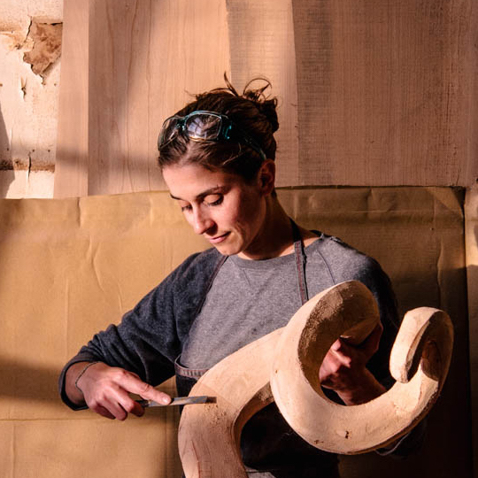
Data StoriesData Sculptures with Adrien SegalIn this episode, we have artist and sculptor Adrien Segal on the show to talk about her beautiful, thoughtful, and engaging data sculptures.
Adrien is based in Oakland, California. Her work has been exhibited internationally in galleries and museums around the world.
On the show, we talk about some her great artwork, including Tidal Datum, which depicts tidal charts from the National Oceanic and Atmospheric Administration (NOAA), and Grewingk Glacier, an ice sculpture depicting “the shape of the terminus of Grewingk Glacier as it has receded over 150 years time.”
We also talk about the pr...
2017-09-2059 min
Data StoriesData Visualization at Twitter with Krist Wongsuphasawat
[Help us run the show by supporting us on Patreon!]
This week we have Krist Wongsuphasawat on Data Stories to talk about visualization projects at Twitter. Krist has a Ph.D. in Computer Science from the University of Maryland, where he worked with Ben Shneiderman. Most recently, he has been a Data Visualization Scientist at Twitter since 2012.
On the show, Krist describes the kinds of projects that the visualization team at Twitter develops. He also walks us through a few of the most popular of these projects, including their famous visualization of Game of Th...
2017-09-0546 min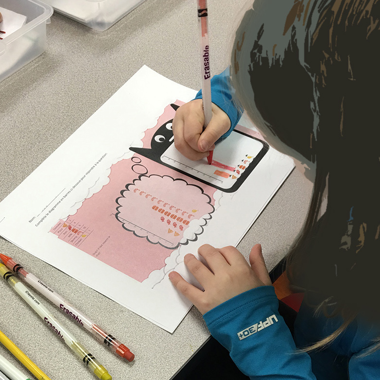
Data StoriesVisualization Literacy in Elementary School with Basak Alper and Nathalie Riche[If you enjoy our show, consider supporting us on Patreon! You pay the amount of one or two lattes for each episode we publish every two weeks.]
In our latest episode, we talk about “C’est La Vis,” a research project developed to teach visualization at the elementary school level. We have two of the project researchers on the show, Basak Alper from NASA JPL and Nathalie Riche from Microsoft Research, to tell us all about it.
On the show we talk about the inception of the project, the findings they discovered by both talking to teac...
2017-08-1842 min
Data StoriesExplorable Explanations with Nicky Case[If you enjoy our show, please consider supporting us on Patreon! For the price of one or two lattes per episode, which we publish every two weeks, you can help make sure that Data Stories keeps getting made!]
This week we have Nicky Case on the show to talk about “explorable explanations,” interactive simulations that help people understand complex ideas.
Nicky has developed a whole set of projects over the years, including the popular “Parable Of The Polygons,” which describes how small biases can lead to segregation, and “To Build A Better Ballot,” which demonstrates the impact of...
2017-08-031h 03
Data StoriesUnderstanding Comics and Visual Storytelling with Scott McCloud*** SUPPORT US ON PATREON! If you enjoy our show, consider supporting us on Patreon! You can contribute just the cost of one or two lattes for each episode we publish every two weeks. ***
In this episode we have famous cartoonist and comics theorist Scott McCloud. Scott wrote the popular books Understanding Comics (1993), Reinventing Comics (2000), and Making Comics (2006), which explain the theory and practice behind making comics and telling stories visually.
Scott has gained a big following among data visualization designers over the years. By following the strategies he describes in his books, one can develop ric...
2017-07-1739 min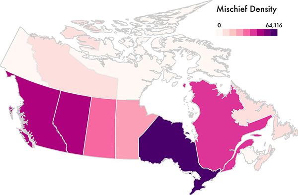
Data StoriesSurprise Maps with Michael Correll and Jeff Heer
[If you enjoy the show, consider supporting us on Patreon! You pay a small fee for each episode we publish.]
In this episode, we have Michael Correll and Jeff Heer from the University of Washington to talk about a novel visualization technique they developed called “Surprise Maps”: a new kind of map which visualizes what is most surprising in a dataset.
Using their own words: “The idea behind Surprise Maps is that when we look at data, we often have various models of expectation: things we expect to see, or not see, in our da...
2017-06-3022 min
Data StoriesData Stories 100!!!It seems almost impossible right?! And yet, here we are with our 100th episode! Data Stories has been around for more than five years and now we mark this big milestone.
This is a good opportunity to thank all of you for listening to us and for supporting us with your comments, ideas and suggestions. It is also a good opportunity to thank all of our guests for making this show possible and donating their time to us.
In this episode we review some of the most successful episodes, talk about the major categories of ep...
2017-06-151h 42
Data StoriesData Visualization at Capital One with Kim Rees and Steph HayIn this episode we are joined by Kim Rees and Steph Hay of Capital One. You may have heard the big news that Capital One recently decided to hire Kim Rees (formerly of Periscopic) as their Head of Data Visualization.
It’s great to see such a big company hire a high caliber data viz professional like Kim and create a position with this name. Things seems to be moving in the right direction for viz after all!
Curious about what this news might mean for the industry, we invited Kim and her new boss Steph...
2017-06-0249 min
Data StoriesData Sketches with Nadieh Bremer and Shirley WuIn this episode Moritz meets Nadieh Bremer and Shirley Wu for a face-to-face episode in Berlin.
Nadieh and Shirley recently paired up to create Data Sketches, a twelve-month collaboration. Each month they choose a topic and develop a visualization on their theme.
One nice aspect of the project is that they keep track of their entire development process, including the steps they followed to prepare the data, sketch the ideas, and create the final visualizations.
On the show we talk about the organization of the projects, some favorite visualizations from the year, the partne...
2017-05-1743 min
Data StoriesCalling Bullshit with Carl Bergstrom and Jevin WestIn this episode we have Carl Bergstrom and Jevin West, two professors at the University of Washington, who talk about a fantastic new course they have designed called “Calling Bullshit“. The course aims to teach students what bullshit is, how to spot it, and how to deal with it. Needless to say, it’s timely. It’s also gotten a lot of attention lately.
Of course there are plenty of bullshit examples in data analysis and visualization. Carl and Jevin discuss many of them in their course.
On the show we talk about how they developed the...
2017-05-0242 min
Data StoriesInnovation from Research with Jarke Van Wijk
We have Jarke Van Wijk on the show this week. Jarke is a professor of visualization in the Department of Mathematics and Computer Science at Eindhoven University of Technology and an important historical figure (shall we say legend?) in visualization research.
Many amazing innovative techniques have been developed in his lab, including the widely adopted squarified treemaps (treemaps optimized to use rectangles as close as possible to squares) and hierarchical edge bundling (a technique to bundle the links of a graph together).
In this episode we hear the stories behind many of the innova...
2017-04-2057 min
Data StoriesChallenges of Being a Vis Professional in Industry with Elijah MeeksThis week, we have Elijah Meeks on the show to talk about the state of data visualization jobs in the industry.
Elijah sparked a recent debate with the following Twitter message: “Most people in #Datavisualization end up transitioning into data sci/eng or UI because there’s something wrong with the state of dataviz.” His tweet struck an interesting chord, so we thought we would bring him on the show to hear more.
In the episode, we talk about what is going on in the data visualization field and whether there really is a problem for data...
2017-04-0653 min
Data StoriesUncertainty and Trumpery with Alberto Cairo[Hey friends, help us fund the show by donating to Data Stories on Patreon! We’re counting on you to switch to a crowdfunding model. Please visit our Patreon page for more details: https://www.patreon.com/datastories.]
In this episode, we have Alberto Cairo from the University of Miami on the show to talk about his newly announced lecture series on “Trumpery” and uncertainty.
Visualization and statistics promise to help people think and behave more rationally, but as we all know there is much more to fulfilling this promise than just showing “the right” graph.
...
2017-03-211h 02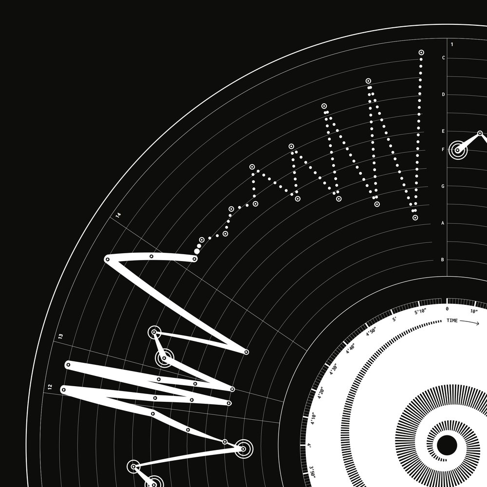
Data StoriesOddityViz with Valentina D’Efilippo and Miriam Quick
We have designer Valentina D’Efilippo and researcher Miriam Quick on the show to talk about their recent project OddityViz, a series of data visualizations of “Space Oddity,” the famous David Bowie song.
Valentina and Miriam deconstructed “Space Oddity” into multiple data sets to capture different aspects of the song: its narrative, rhythm, melody, and lyrics. Then they used each element to create a a unique data visualization piece.
They printed the visualizations as a series of posters and laser-carved acrylic black discs. Beautiful!
On the show we talk about their background...
2017-03-1040 min
Data StoriesA Tribute to Hans Rosling
As you may have heard, Hans Rosling passed away on February 7, 2017. We are deeply saddened by this loss and, in remembering Rosling, we thought a tribute to him was due. The impact Rosling had on visualization and statistical communication is huge; he has left a very big legacy.
In this special episode, we asked five renowned visualization experts to tell us how Rosling’s work influenced them and how he impacted their own work. Here we hear from Kim Rees (Periscopic), Andy Kirk (Visualisi...
2017-02-2700 min
Data StoriesHighlights from IEEE VIS'16 with Jessica Hullman and Robert KosaraIn this episode, Jessica Hullman and Robert Kosara join Enrico at IEEE VIS’16 to discuss highlights from the conference, including noteworthy presentations, papers, panels, workshops, and overall major trends.
(From Robert Kosara’s talk “Empire built on sand”)
(From Best Paper recipient, Vega-Lite)
(From presentation, TextTile)
(From presentation, “Iterating between tools to create and edit visualizations”)
LINKS
Pedagogy of Data Visualization
C4PGV Workshop
BELIV Workshop
2016-11-111h 11
Data StoriesThe Hustle with Mahir Yavuz and Jan Willem Tulp
This week we have Mahir Yavuz and Jan Willem Tulp on the show to talk about navigating the business side of data visualization. Mahir is Creative Director of Data Science and Visualization at R/GA and Jan Willem is a data visualization freelancer and founder of Tulp Interactive.
“How do you choose which projects to work on? How do you actually get paid for them? How do you deal with ‘The Data Will Come Soon’ syndrome? And what do you do with unreasonable requests from clients?”
We talk about these and other issues. This is a perfect...
2016-08-2551 min
Data StoriesPolygraph and The Journalist Engineer Matt DanielsWe have Matt Daniels on the show, the “journalist engineer” behind Polygraph, a blog featuring beautiful journalistic pieces based on data. If you are not familiar with the site, stop now and take a look.
Matt starts with a simple question — for example, what songs from the ’90s are still popular? — and tries to answer it through data analysis and visualization. The result is always a well-crafted web page and applications, with a mix of data analysis, interactive graphics, and explanations.
On the show we talk specifically about two projects: “The most timeless songs of all-time,” in w...
2016-07-0151 min
Data StoriesTapestry Conference Review with Robert KosaraHey guys, this is a special edition from Tapestry, the conference on Data Storytelling that brings together visualization experts, journalists, designers, NGOs, academics, and more.
Enrico sits down with Robert Kosara to recap the conference, especially the keynotes and some of the short story talks. Plus, Robert fills us in on how to participate in Tapestry conferences in the future.
Enjoy the show!
Links
Scott Klein
Jessica Hullman
Nick Sousanis
Catherine Madden
Alan Smith
Eva Galanes-Rosenbaum
RevEx (Review Explorer) – Tool from Enrico’s lab
Tapestry YouTube Channel
The transcript for this episode is ava...
2016-04-0630 min
Data StoriesIEEE VIS’15 Recap with Robert Kosara and Johanna Fulda
In our latest episode, Enrico recaps the IEEE VIS’15 conference with Robert Kosara and Johanna Fulda, and we compare notes about conference projects and papers. Find the transcript here, and check out our long list of selected projects below with plenty of links and video previews!
Data Stories is brought to you by Qlik, who allows you to explore the hidden relationships within your data that lead to meaningful insights. Check out a new blog post from the Qlik Blog called “People Are Smart: Data Literacy and Broad Audiences”. As you may know Data Litera...
2015-11-131h 09
Data StoriesUpcoming DS Events and Some of Our Recent ProjectsHey folks, we are back! We really hope you had a good summer.
We start the new season with an “internal” episode. We give numerous updates on Data Stories. Things have changed recently — we have future ideas and two great events to get in touch with us!
The Visualized Conference, taking place in New York on Oct 7-10, 2015, is going to host a Data Stories Meetup on Oct 7, 2015. If you live in NYC or happen to be around please drop by! We’d love to meet and talk with you.
We will also offer an Ask Me Anythin...
2015-09-241h 09
Data StoriesDisinformation Visualization w/ Mushon Zer-AvivHi everyone!
We have designer and activist Mushon Zer-Aviv on the show today. Mushon is an NYU ITP graduate and instructor at Shenkar University, Israel.
He wrote the very interesting Disinformation Visualization piece for Tactical Tech’s Visualizing Information for Advocacy and we decided to invite him to discuss the million different facets of disinformation through visualization.
Is data and data visualization bringing some truth or should it always be considered an argument? Is there a way we can mitigate or even prevent disinformation? What strategies can designers use to make their opinions more a...
2015-06-121h 07
Data StoriesVis Going Mainstream w/ Stamen's CEO Eric Rodenbeck
We are now sponsored by Qlik. You can download it for free here.
Great episode here folks! We have Stamen‘s CEO Eric Rodenbeck on the show to talk about “Visualization Going Mainstream”. Moritz took inspiration from Eric’s Eyeo talk “And Then There Were Twelve – How to (keep) running a successful data visualization and design studio.” and decided he must come on the show.
Stamen is a design studio in San Francisco founded in 2001 by Eric. They have been real pioneers in data visualization and cartographic mapping with the production of great apps and librari...
2015-02-1056 min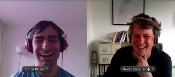
Data StoriesMoritz and Enrico on Books, Data Literacy, Their Projects, Etc.[We are now sponsored by Qlik. You can download it for free here]
Hi Folks,
This is some kind of new experiment: it’s just us, Enrico and Moritz, on the show. We talk about stuff we normally don’t have the opportunity to talk about when we have a guest. We feel it’s nice to have from time to time something different. We hope you like this new format!
In this episode we talk about some books we like and suggest, updates on some of our work, and about data literacy. If you w...
2015-01-281h 12
Data StoriesNarrative Visualization Research w/ Jessica Hullman
Hey yo! We are back!
We have a very researchy kind of episode this time. Jessica Hullman is on the show to talk about her research on narrative visualization. Jessica is a Postdoctoral Fellow at Berkeley and soon to be Assistant Professor at University of Washington iSchool.
In the show we talk about lots of interesting basic visualization research issues like visualization literacy, bias and saliency, uncertainty, and some interesting automated annotation systems that Jessica has developed.
We also talk about Jessica’s background in experimental poetry!
Have fun.
2014-09-191h 02
Data StoriesVisual Storytelling w/ Alberto Cairo and Robert Kosara
Hi all,
Hot topic today! We invited Alberto Cairo and Robert Kosara to discuss the role of storytelling in visualization. What is storytelling? Is all visualization storytelling? Should we always strive for telling a story? How does storytelling match with exploratory visualization? Should we aim more for worlds and macroscopes than stories as Moritz advocated a while back at Visualized? We went on a somewhat lengthy discussion on these topics and I think we all ended up agreeing on a lot of things and developed a much more nuanced view of storytelling. As you can see...
2014-04-161h 18
Data StoriesHigh Density Infographics and Data Drawing w/ Giorgia Lupi
Hi folks,
We have Giorgia Lupi from Accurat on the show with us this time in our first real face-to-face episode ever — yes Moritz and Enrico in the same room!
Giorgia’s work, and generally the work done by her agency, has been super popular lately. You might have seen, for instance, their work visualizing Nobel Prizes or visualizing painters’ lives.
Giorgia kindly hosted us in the Accurat’s studio in New York where we had a nice chat on hand-crafted visualization, high-density designs, design studios, and much much more.
Here is...
2014-02-1857 min
Data StoriesThe Information Flaneur w/ Marian DörkHi there,
We have Marian Dörk on the show today to talk about the “Information Flaneur”: an approach to data visualization centered on navigating, exploring, browsing and observing data with curiosity to learn about what’s there, and to see and be surprised by new thoughts and discoveries.
Marian is Research Professor at the University of Applied Sciences Potsdam near Berlin where he works on “exploring novel uses of interactive visualizations to support a wide range of information practices.”
We talk about many interesting new directions for visualization like visualizing data starting from a few se...
2013-12-101h 02
Data StoriesIEEE VIS'13 Highlights w/ Robert KosaraHi Folks!
We did it again: we have a special episode directly from IEEE VIS’13 (the premier academic conference on visualization). Enrico caught Robert Kosara and recorded almost one hour of highlights from the conference. And there is a final message for Moritz too! Don’t miss it.
Take care.
—
Links (some of the papers mentioned):
Chart Memorability
Sketchy Story (freeform data visualization)
Understanding Sequence in Narrative Visualization
Nanocubes (large-scale visualization on the web)
Visual Sedimentation (handling dynamic/streaming data)
Robert’s Conference Report on Eagereyes
IEEE (VisWeek) VIS Papers on the Web ...
2013-10-2849 min
Data StoriesVisualization Beyond the Desktop w/ Petra IsenbergHi Folks!
We are back after a relaxing summer with a brand new episode! We have Petra Isenberg, from the Aviz team at INRIA (we’ve had other guests from the same lab in the past) to talk about visualization on non-standard devices and environments. Yes, stuff like display walls, surfaces, tabletops, and people collaborating around them. It feels like the future is here and there’s a ton of potentially interesting applications for visualization!
Petra gives us hints about what works and what does not work, what the research says, what has been tried alread...
2013-09-0958 min
Data StoriesVisualization on Mobile & Touch Devices w/ Dominikus BaurHi Everyone,
In this episode we talk about visualization on mobile and touch devices. How do you design visualization interfaces for these kinds of devices? How different is it to interact with your fingertips rather than with your mouse? Advantages, disadvantages, unexplored opportunities?
We discuss with Dominukus Baur, interaction designer and mobile data visualization specialist. You can see his work on his website/blog. Make sure to give a look to his talk at the OpenVis Conference: Data on Your FingerTips. He gives lots of useful tips!
Episode Chapters
00:00:00 Enrico and Mo...
2013-07-121h 04
Data StoriesNYT Graphics and D3 with Mike Bostock and Shan Carter
Hi everyone,
We have graphic editors Mike Bostock and Shan Carter in this dense and long episode. It’s great to finally have someone from the New York Times!
We talk about many practical and more philosophical aspects of publishing interactive visualizations on the web. We also spend quite some time discussing the past, present and future of D3.js.
(On a side note: apologies for starting a bit abruptly and for the weird noises. Enrico was desperately and unsuccessfully trying to find a quiet and calm spot at the CHI confer...
2013-05-091h 21
Data StoriesWith Santiago Ortiz
Hi Folks,
We have Santiago Ortiz with us today. Santiago has an impressive array of data visualization projects he has been pouring out during the last year and a very unique style. See for yourself in his portfolio website: http://moebio.com/. We talk about the Tapestry Conference, mathematics, the business of data visualization and much much more. Enjoy it!
Chapters
00:00:00 Start
00:00:01 Intro: our guest today: Santiago Ortiz (@moebio)
00:01:55 Tapestry conference
00:08:40 Santiago: how it all began: Flash, math and teaching
00:11:34 Bestiario
00:13:23 Impure/Quadrigram
00:14:17 Freelance since 2012
2013-03-111h 18
Data StoriesWith Robert Kosara
Hi all,
We got Robert Kosara on Data Stories for this episode. Robert is the editor of eagereyes.org, one of the most respected and well-known data visualization blogs in the Internet. He is known for his controversial and informative posts and his “academic” style (some people say :)).
But Roberts, as he says in the show, wears many hats. He was a Professor of Computer Science at UNC Charlotte until recently when he surprisingly moved to Tableau after being tenured.
In the show we talk about his choice and many other things...
2012-12-061h 17
Data StoriesData Stories Hangout
Hi there,
We just finished recording the hangout. 10 people joined it and some more followed the stream off-line. If you wanted to participate and you could not — we are sorry but there is a limit of maximum 10 people imposed by Google.
We really enjoyed the hangout and it was a fantastic experiment full of interesting questions and comments.
Among others, we had Kim Rees from Periscopic, Benjamin Wiederkehr from Interactive Things, Santiago Ortiz, Stephen Boyd, Miska Knapek, Wes Grubbs from Pitch Interactive, Karen Doore from UT Dallas, Yuri Engelhardt and Jim Valla...
2012-11-131h 05
Data Storiesfrom Visweek 2012Hey Folks!
I managed to grab a couple of buddies at VisWeek and record a (low audio quality – sorry) episode with some on-the-spot comments. Andrew Vande Moere (infosthetics.com) and Jerome Cukier joined me to have some fun and indulge in some gossiping.
A few papers we mention in the episode (may be not complete):
How Capacity Limits of Attention Influence Information Visualization Effectiveness. [Best Paper award]. Steve Haroz, David Whitney.
Evaluating the Effect of Style in Information Visualization. Vande Moere et al.
Investigating Physical Visualizations. Yvonne Jansen et al.
Sketchy Rendering for Information Visuali...
2012-10-2348 min
Data Storiesemoto (with Stephan Thiel from Studio NAND)
Hi Folks,
In this episode we talk about emoto, the project on visualizing the sentiment of the Olympic Games in London 2012.
Since Moritz was one of the principal designers and developers behind the project, we thought: “hey, why not?!”
And we have a special guest! Stephan Thiel from Studio NAND joined us to share his own view and experience with the project.
Make sure to give a look to the emoto web site and the accompanying blog before listening to the podcast if you can, this will help you followin...
2012-09-131h 06
Data StoriesHand crafted data (with Stefanie Posavec)Hi Everyone,
It’s been a long time since our last episode. Sorry, sorry, sorry! Moritz was/is busy with Emoto and the London Olympics, Enrico is moving (with the whole family) to New York City.
In this episode we have the honor to talk with “data illustrator” Stefanie Posavec. Stefanie makes fascinating hand-crafted visualization like Literary Organism and (En)tangled Word Bank. Most of her work is done by hand, like the highlighted text of Jack Kerouac’s On The Road, and this is so intriguing that we wanted to know more about this process....
2012-08-141h 05
Data StoriesInterview with Jeff HeerHi Folks,
We are raising the bar here!
In this new episode we have Jeff Heer, Assistant Professor at Stanford and creator of 4 (!) data visualization toolkits/languages (Prefuse, Flare, Protovis, D3).
Jeff is a very well regarded researcher in the area of visualization, user interfaces and human-computer interaction. If you don’t know him yet we strongly encourage you to give a look to his projects web page, you’ll find lots of cool stuff there like his studies on Graphical Perception and Wrangler, a data pre-processing tool.
Talking with Jeff has b...
2012-06-281h 16